


DealWise
Brand identity for DealWise, a beyond banking platform developed by ING Bank that gathers cashback deals and great discounts in one place.
Quest:
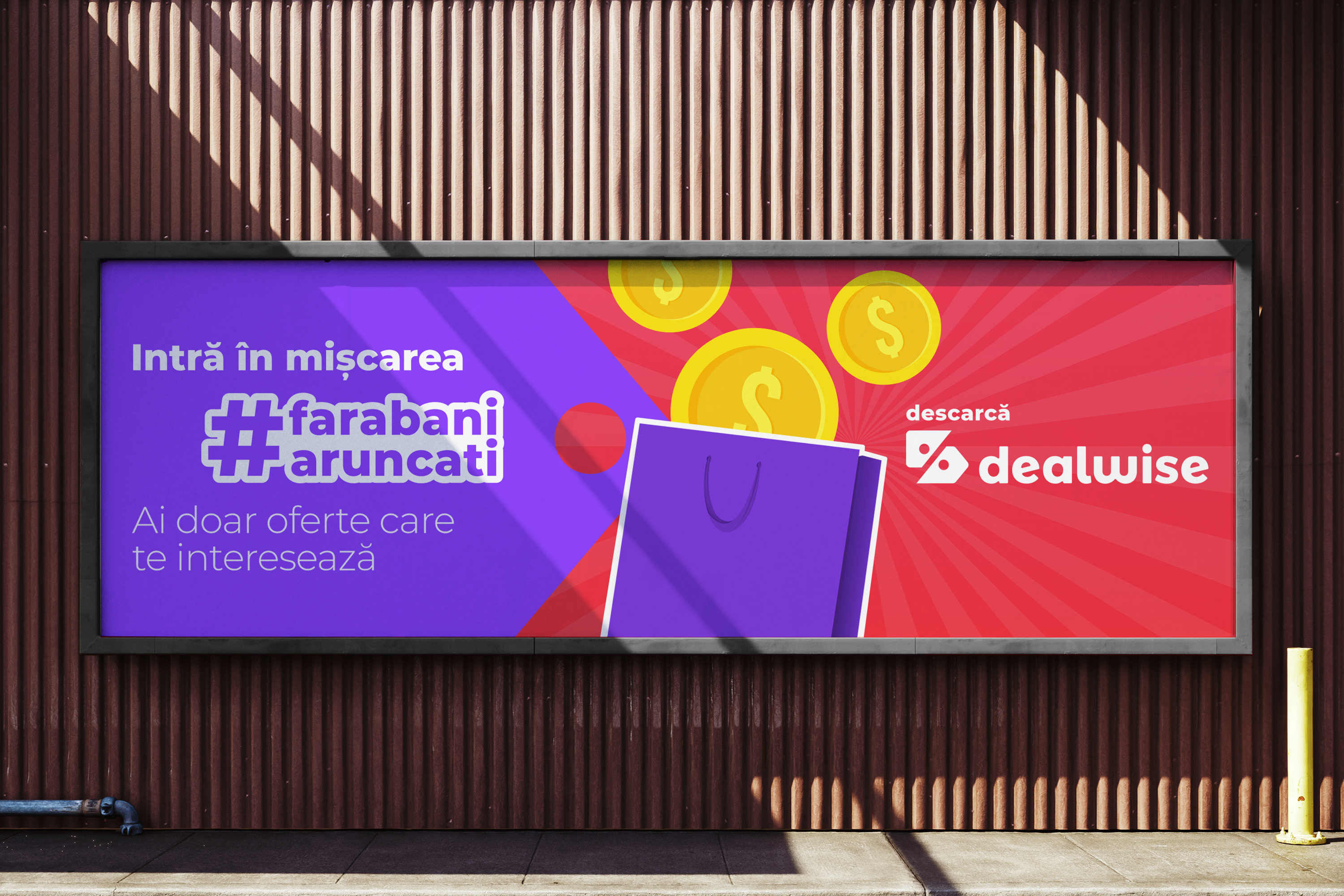
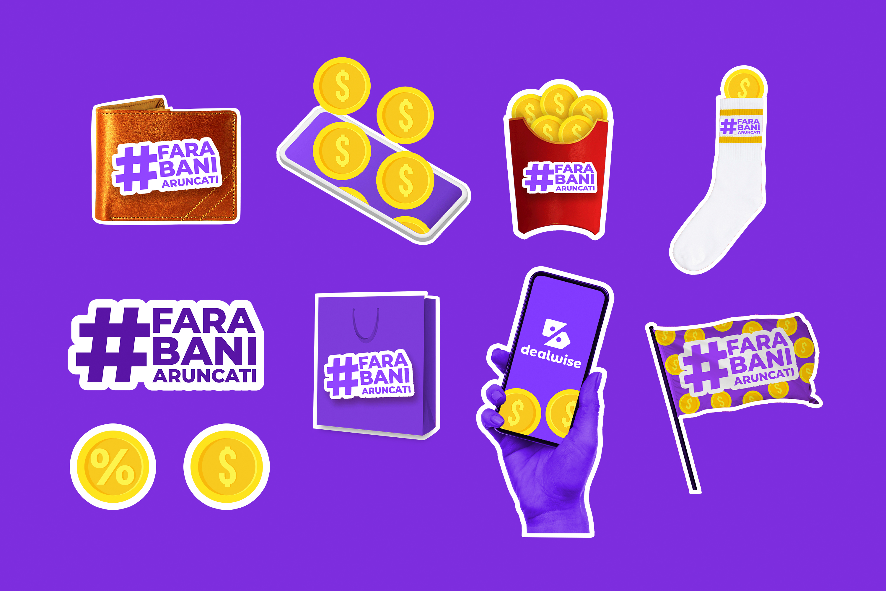
Everyone likes a deal, but none of us like being spammed with offers, many of which we don’t trust. As a response to this, ING Bank designed DealWise, a platform meant to be the go-to place for smart shopping deals. Not only it takes away the hassle of finding a good offer, but it also helps people save on their daily spending by promoting a healthier financial behavior. By including gamification and social features in the app, DealWise covers all the shopping needs, offering relevant deals based on what people usually buy or look for.
Breakthrough:
When designing its identity, our core objective was creating a simple, human, and easy to remember brand universe, which could easily fit the digital world our audience was part of. The naming was the reflected the product’s belief in smart shopping decisions, combining two key words (“deal” and “wise”) and merged them into one name. In the logotype, we chose to only use lower case, to make it as accessible and friendly as it got.
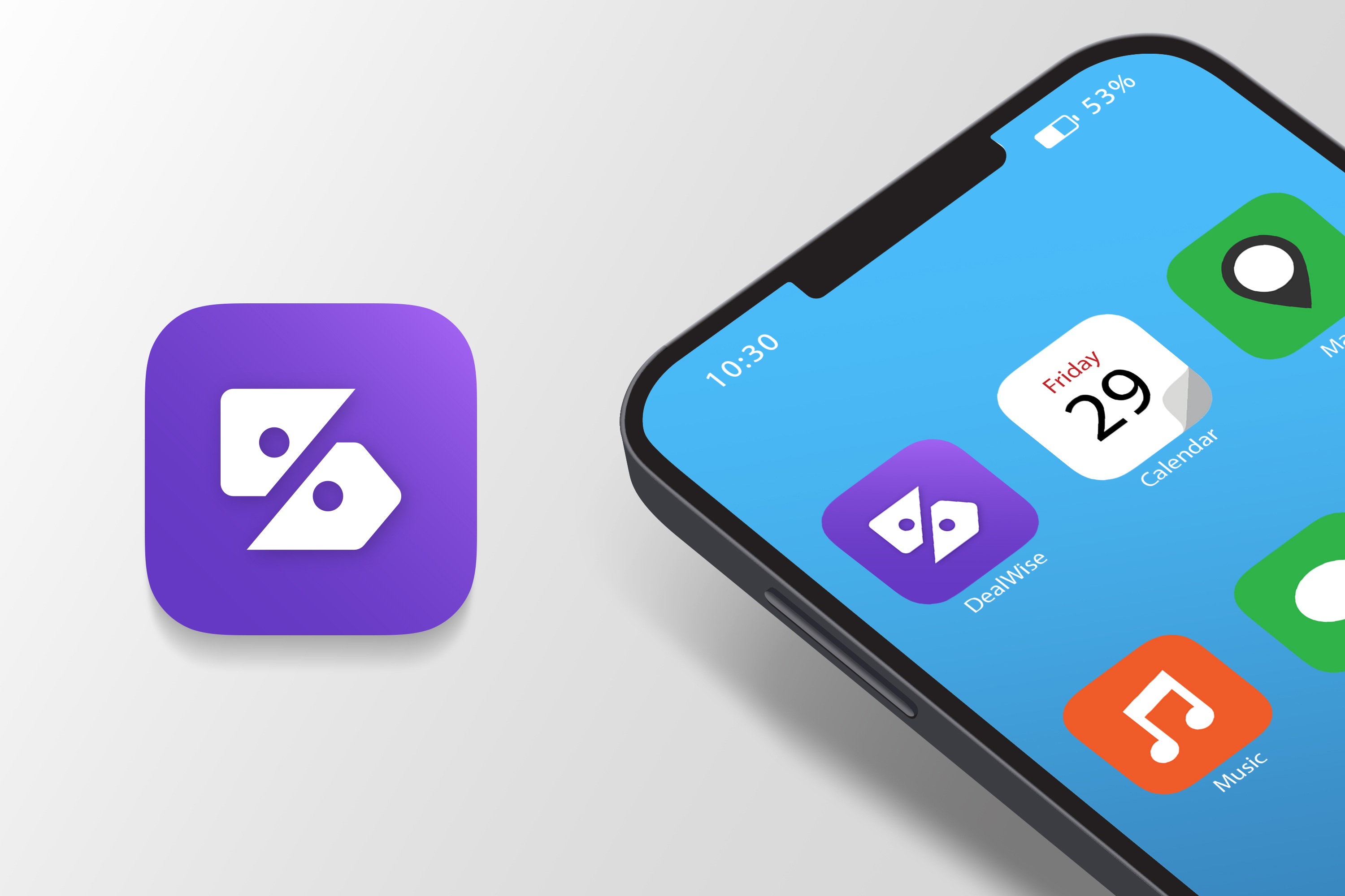
Visually, the icon translated very straightforwardly the functional benefit of the product, depicting the shopping category by integrating the price tag and the % sign which stood for flawless cashback and great deals. The logo was complemented by the joyful and friendly visual palette: we added a bit of playfulness through colors, which all worked as a visual expression for the “thrill of a great deal”.
#logo #visualidentity #graphicsystem #visualpatterns #naming #positioning #logo #guidelines #visualsystem