


Salt Bank
Challenge:
Salt Bank is Romania’s first neobank set to revolutionize and challenge the traditional banking conventions. Carre Noir Bucharest was appointed to shape the strategic, verbal, and visual identity in a way that would reflect Salt’s mission to redefine banking in Romania. Our journey has been an adventure of innovation, learning, and passion.
Breakthrough:
”Salt” (English “leap”) noun [C] a big change, increase, or improvement
The name embodies the brand’s aspirations and mirrors its identity: expert, driven, and competitive, yet accessible, empathetic, and perceptive. Salt is not just inclined towards incremental progress but towards ground-breaking changes. Within the (still traditional) banking category, it represents a real and different kind of upgrade. Furthermore, Salt boasts the advantages of being a concise, easily pronounceable, and memorable name, aligning perfectly with the language of the digital world. Yet, it remains familiar, friendly, and unpretentious, seamlessly blending into the basic lexicon of all Romanians.
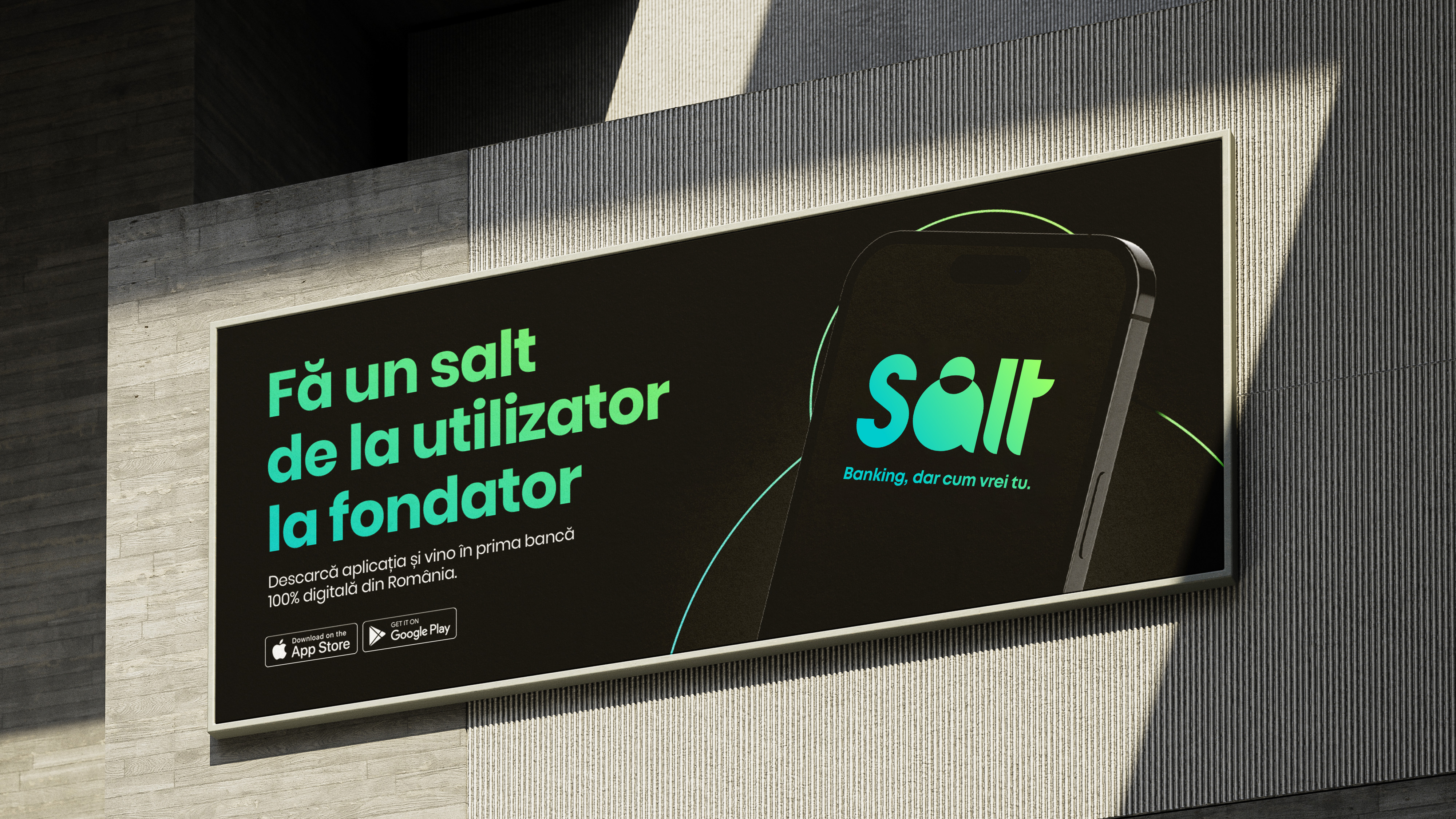
”Banking, dar cum vrei tu” (English “Banking, but as you want it.”)
Despite our commonalities, we are unique. Our uniqueness is also reflected in our distinct connection with money, a particular yet complex blend of emotions, thoughts, and behaviors that influence how we earn, save, spend, and invest. Because money means something different for each of us, Salt brings financial tools tailored to everyone’s specific needs. The slogan "Banking, but as you want it" is a concise yet powerful reflection of Salt Bank's core values: innovation, customer focus, and progressive thinking. It is not just a statement, but a promise that Salt Bank goes beyond providing standard services to deliver banking experiences uniquely tailored to everyone.
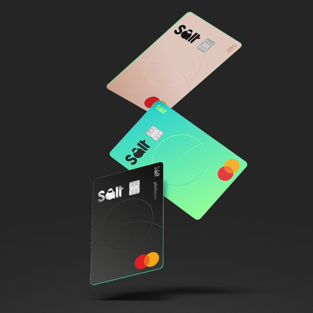
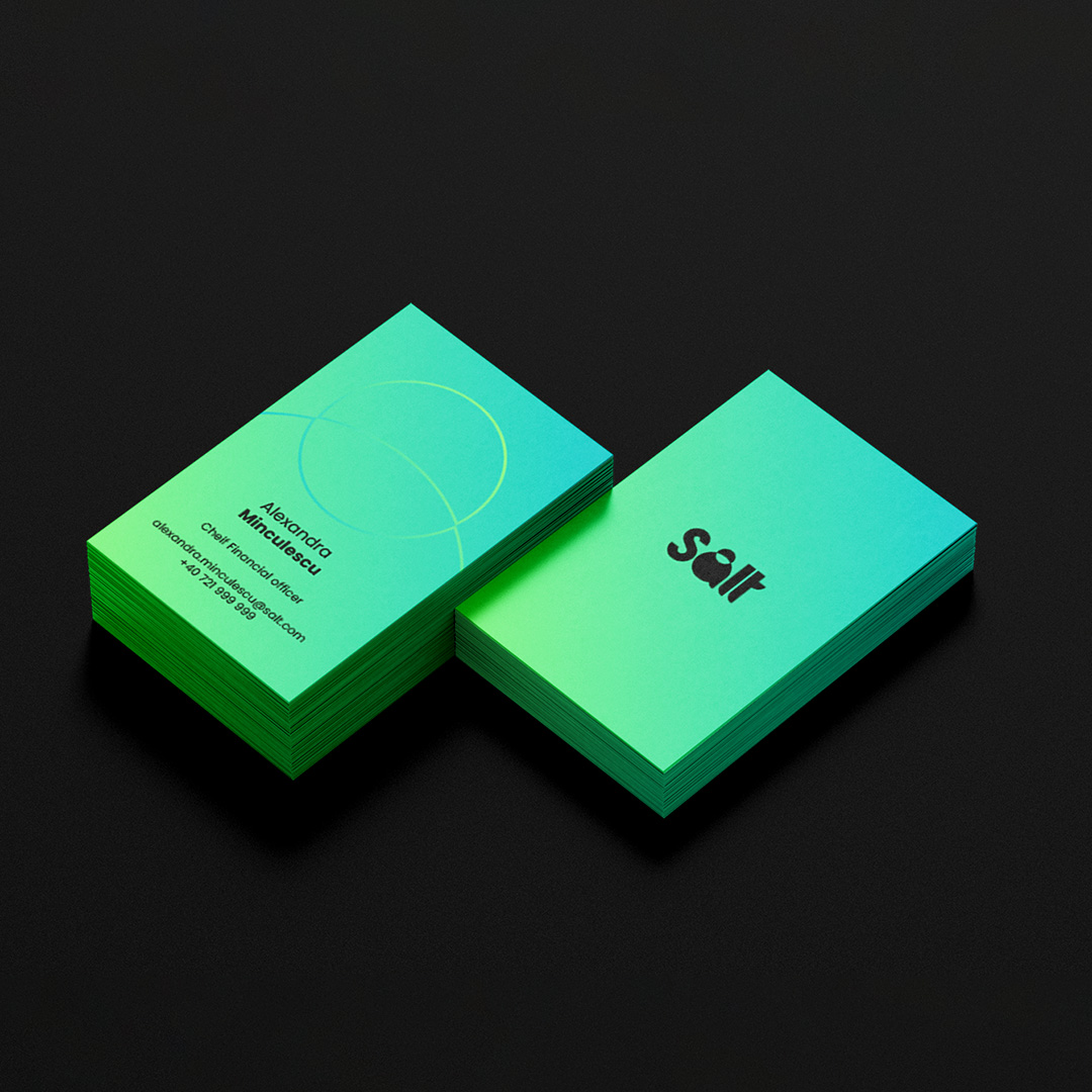
The visual identity of Salt Bank is anchored in its logo design, which uses a bold, sans-serif font for the word "Salt" to convey a sense of modernity and accessibility. The font's clean lines demonstrate a straightforward approach to banking, embodying the brand's commitment to transparency and ease of use. The color scheme adds to the fresh and innovative feel, symbolizing a new wave in the financial industry. The simplicity of the shape demonstrates clarity and efficiency, aligning with the digital nature of the bank. The choice of a more relaxed lowercase for the bank's full name brings a sense of friendliness and approachability, which speaks to the brand's desire to be perceived as empathetic and customer-focused.
#SaltBank #Neobank #BrandPositioning #BrandStrategy #VerbalIdentity #Logo #VisualIdentity #Slogan #BrandUniverse