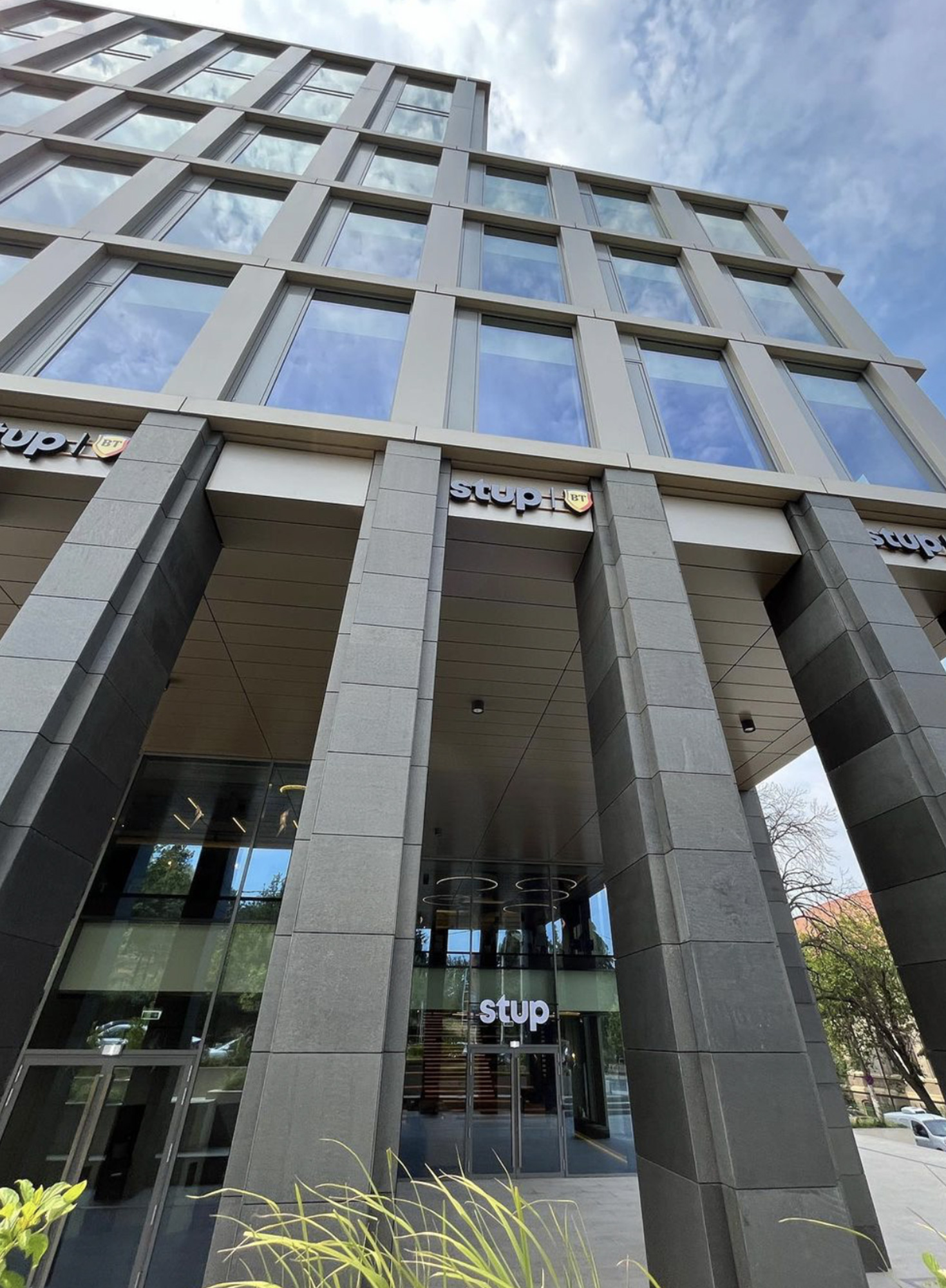
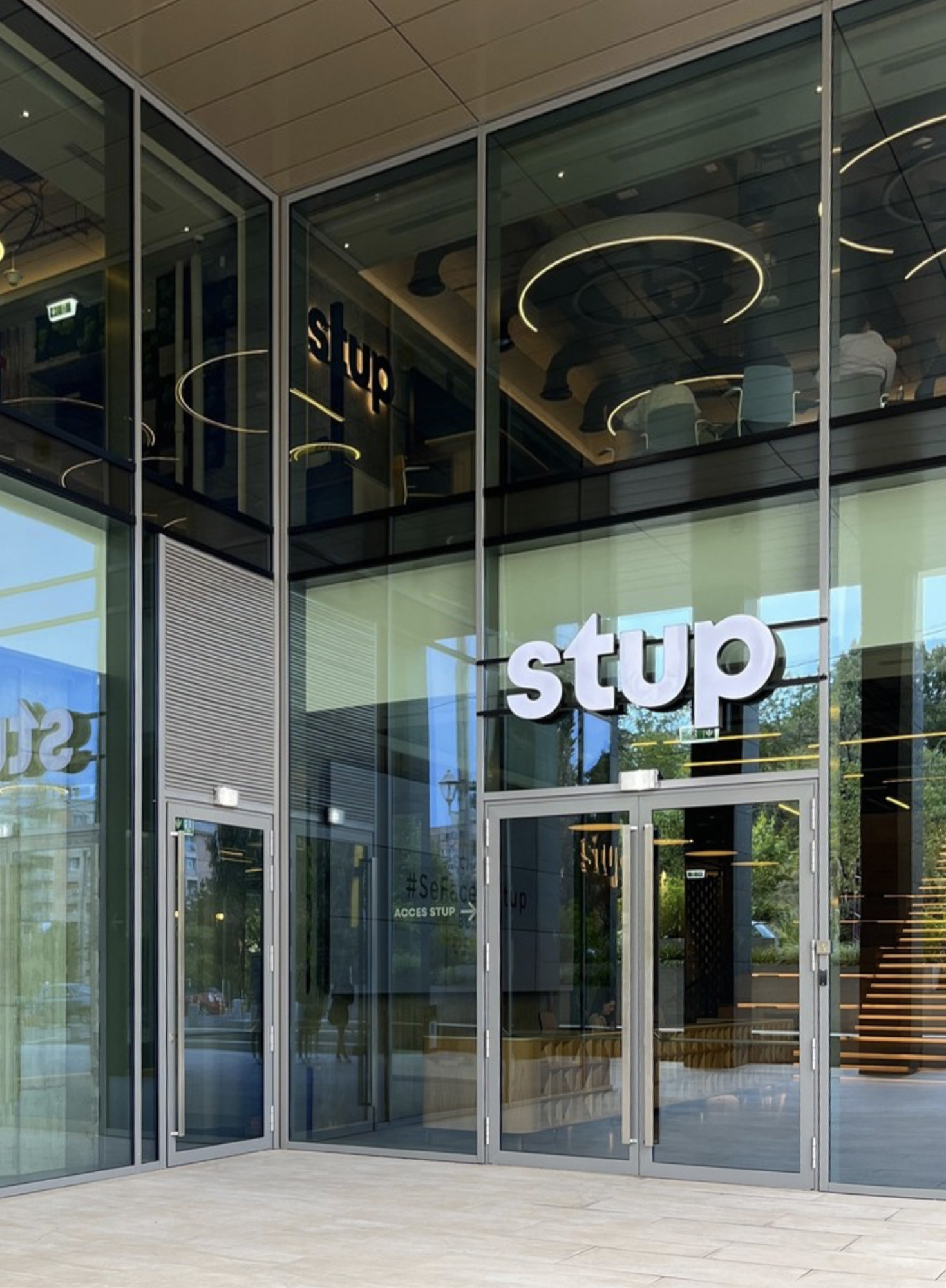
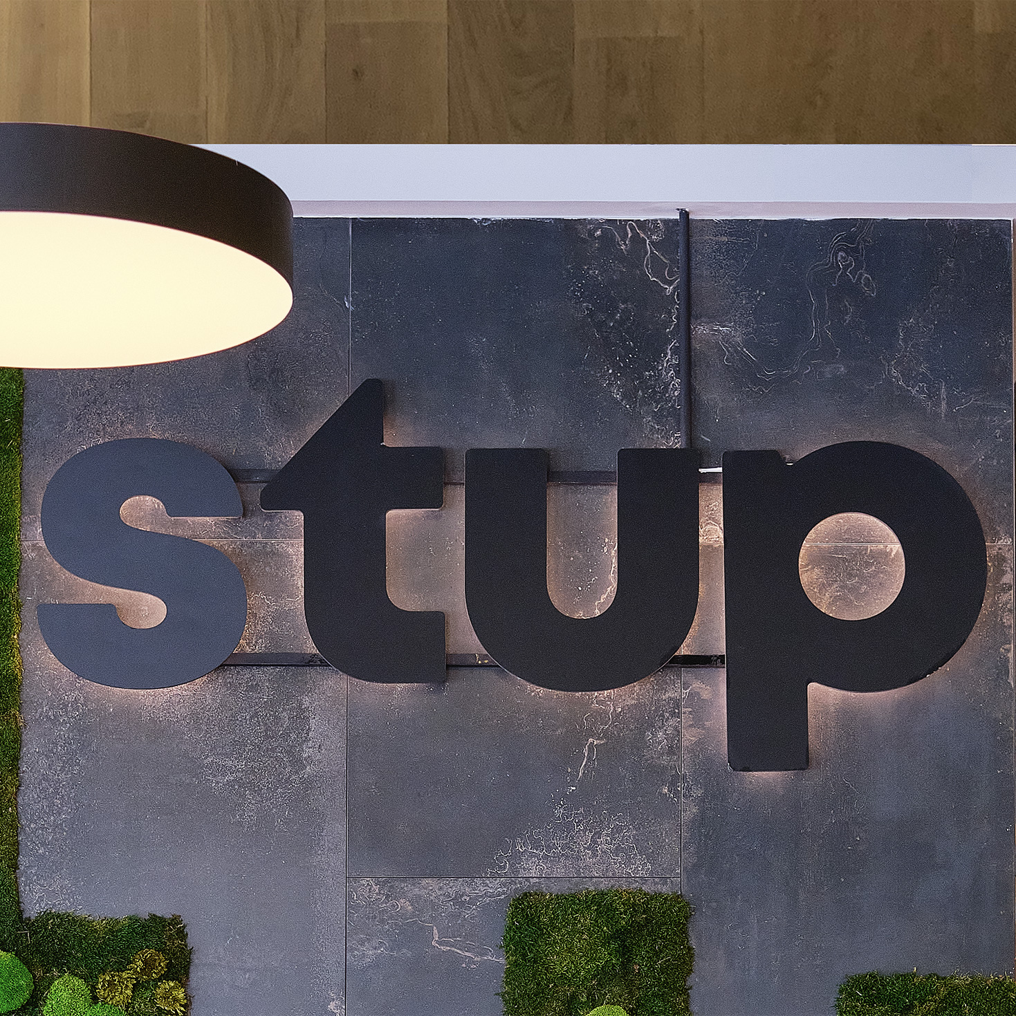
Stup
Brand identity for the first hub built to support the growth of Romanian businesses.
Quest:
Banca Transilvania is the bank dedicated to entrepreneurs and the largest one in Romania, having therefore the absolute duty to support any local entrepreneurial spirit. This is how the idea of hub emerged: a physical and virtual place where small businesses could find solutions to their challenges, guidance, and the whole necessary infrastructure for their development.
Breakthrough:
We started with the name: STUP (beehive). Beehive is an extraordinary form of collaboration of the most hardworking insects that results in great added value. Drawing a parallel, STUP was designed as a space that gives the entrepreneurs the chance to collaborate and generate even greater added value, both for their businesses and for Romania. The name works therefore as an inspiration for people to work together, share ideas and valuable knowledge, while growing the entire local business community. It also feels human, warm, encouraging, and grounded, while being highly relatable for all the small entrepreneurs in Romania.
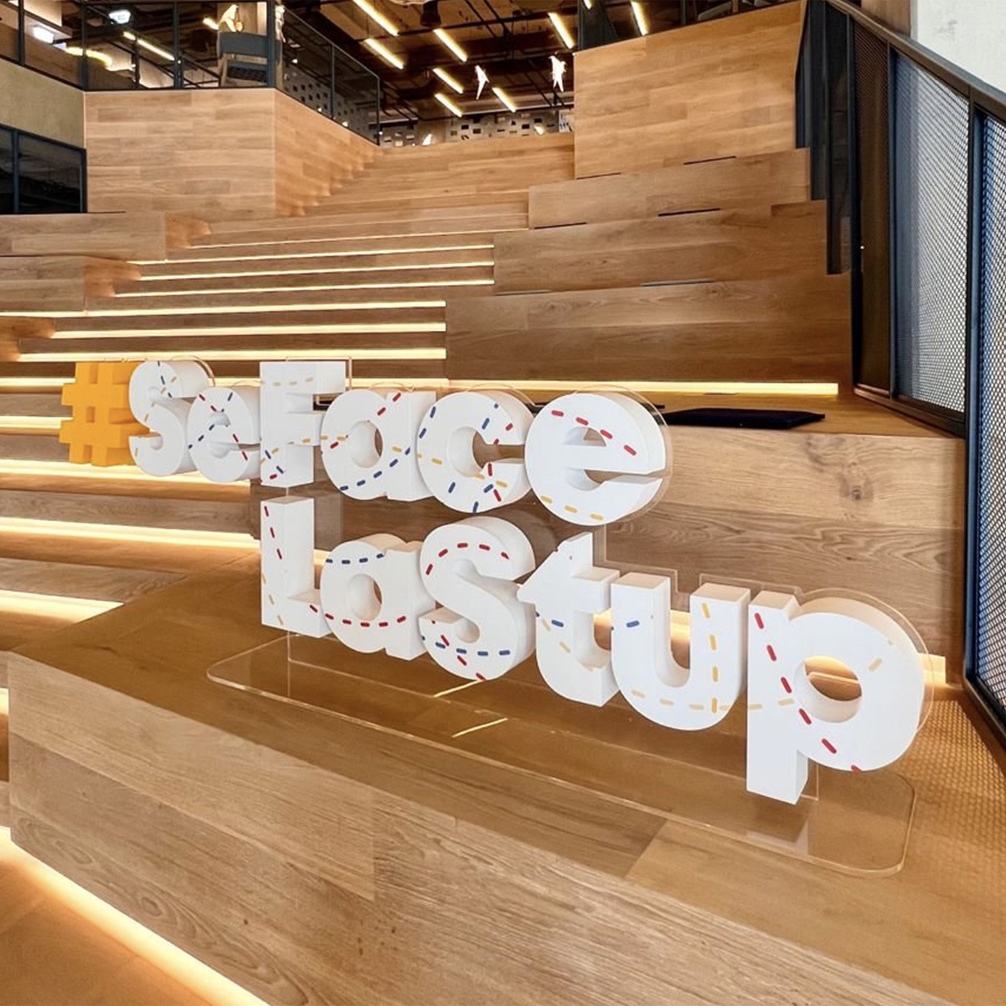
Visually, the intertwined lines stand for collaboration: endless intersections between ideas, solutions, skills, and different work fields that come together, strengthening Romania's local business communities. The entire visual universe conveys continuous dynamic movement towards a common, bigger purpose. The chromatic palette is derived from Banca Transylvania’s visual identity and, at the same time, from the Romanian flag, using red, yellow, and blue as primary tones.
The identity Carre Noir Bucharest developed (name, brand positioning and visual universe) was built on the same set of values as the space itself: togetherness, learning, evolution, growth, transfer of knowledge.
Capabilities tags:
#naming #positioning #logo #guidelines #visualsystem